Today I finally checked out the R package TDAmapper. I found very few tutorials for it, so here’s a bit of discussion
Curiously, there’s a lot more discussion of the math out there than the implementation. I just found Chad Topaz’s “Self-Help Homology Tutorial for the Simple(x)-minded” at his website, and there’s a more technical intro by Elizabeth Munch, and you can look up Ayasdi videos on YouTube for plenty more options — Ayasdi is the company started by Stanford math prof Gunnar Carlsson and others to try to use this mathematics for commercial purposes.
I’m going to just start with the examples in the TDAmapper documentation, though, as I understand the math reasonably well but have tons of questions about implementation that aren’t extensively discussed. Let’s get started!
mapper1D
Quoting from the documentation,
mapper1D(distance_matrix = dist(data.frame(x = 2 * cos(0.5 * (1:100)), y = sin(1:100))), filter_values = 2 * cos(0.5 * (1:100)), num_intervals = 10,
percent_overlap = 50, num_bins_when_clustering = 10)
What’s going on here?
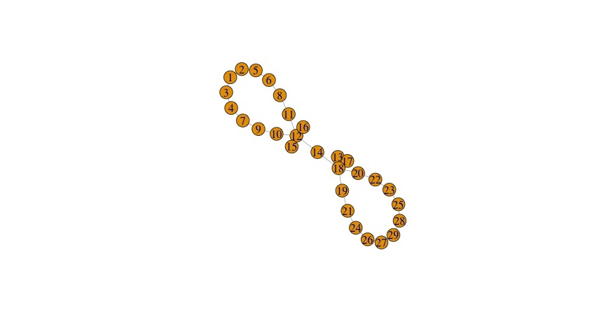
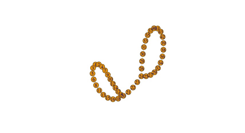
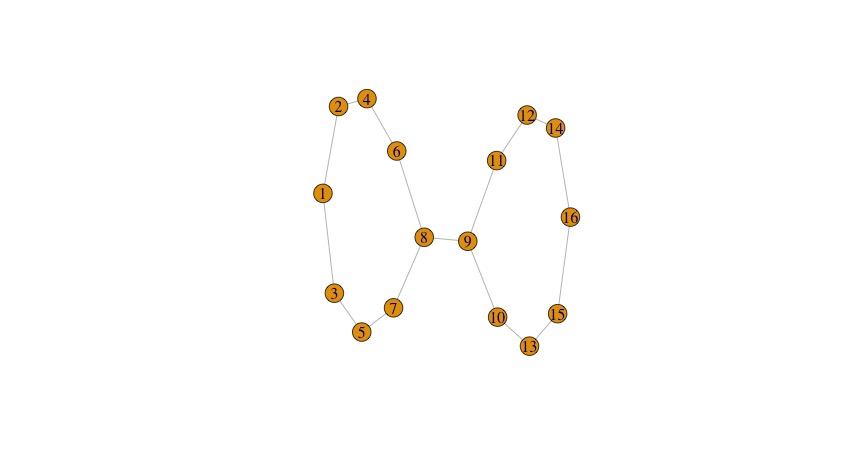
We’ve got data, which here is this cute artificial set in the shape of a infinity symbol:
plot(data.frame(x=2*cos(0.5*(1:100)), y=sin(1:100)))
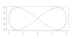
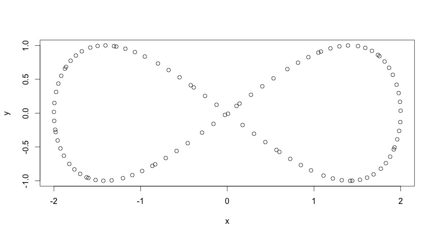
gives an illustration.
What topological data analysis is trying to do is use a filter function from your data set to R (the real numbers) to slice up the data into chunks, figure out clusters in each chunks, make each cluster a node in a new graph, and then put edges between clusters in different slices so that you can reconstruct the data.
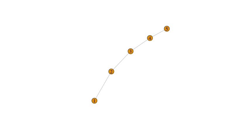
The filter_values option in mapper1d controls these slices. If you read about TDA, you see that how to slice up your data is very important — different ways of slicing will give you different results or viewpoints on the data. Great. How do you figure out what filter function to use? There are a lot of fancy ones discussed. Well, how about just use a projection in this “simple” case? We can see that the x-values for a our infinity symbol range between -2 and 2, so just use 1/25*(1:100)-2, no?
Terrible: my code snippet isn’t displaying correctly, but we get the following image:
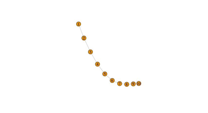
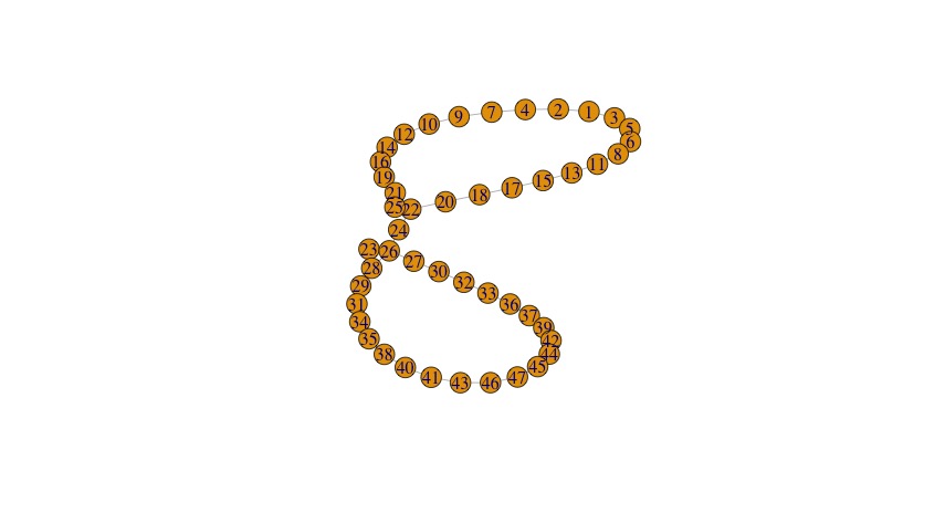
Why? Because our filter function has to be lined up with the data matrix that we entered. There’s no guarantee that our data is “in order,” whatever that might be, so we need to assign each data point to its slice in a way that depends on the actual data. For instance, we can do this by projecting to the x-coordinate (as done in the original example in the documentation) or the y-coordinate. I’ll show the results:
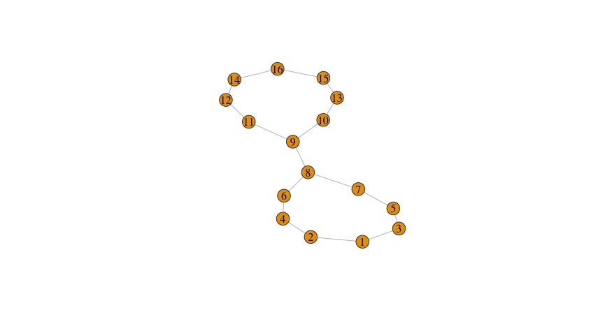
using projection to x-coordinate
using projection to y-coordinate
You can see that projection to the x-coordinate or y-coordinate both work better for capturing the structure of this data, because each of them makes sense in its own way.
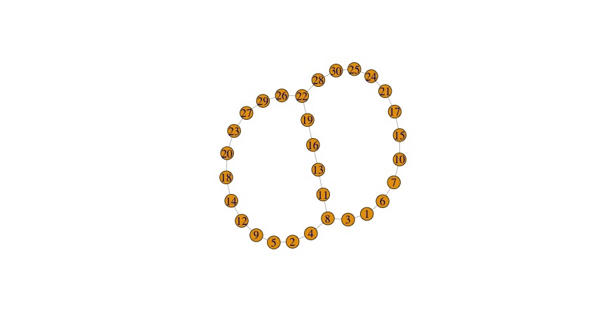
What else? num_intervals determines the number of slices when you’re using the filter function to slice your data. Two few intervals means that you are squishing together data and basically don’t have the resolution to see what is happening. Here’s the output of the example code with just 5 intervals:
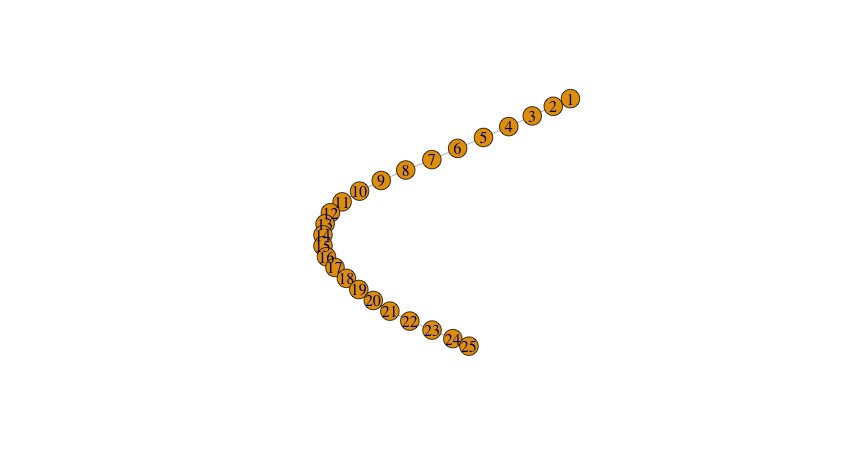
Project to x, but use num_intervals=5
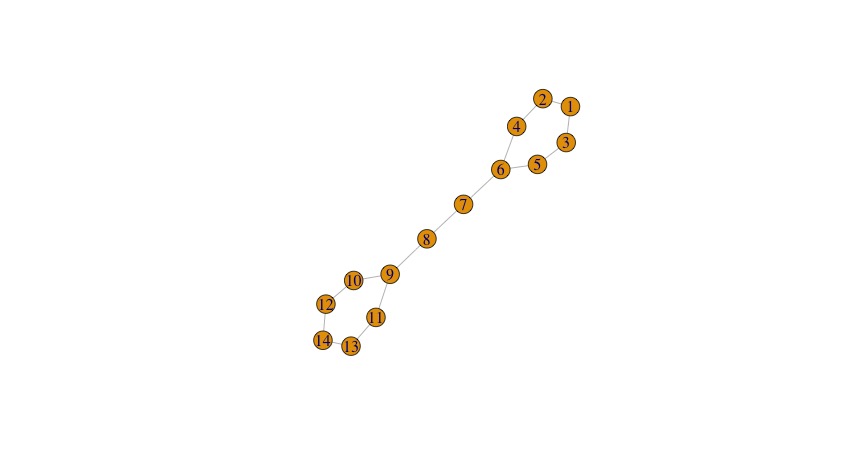
You can hit a sweet spot for a while — above was 10 intervals, and here is 15 intervals:
Project to x, num_intervals=15
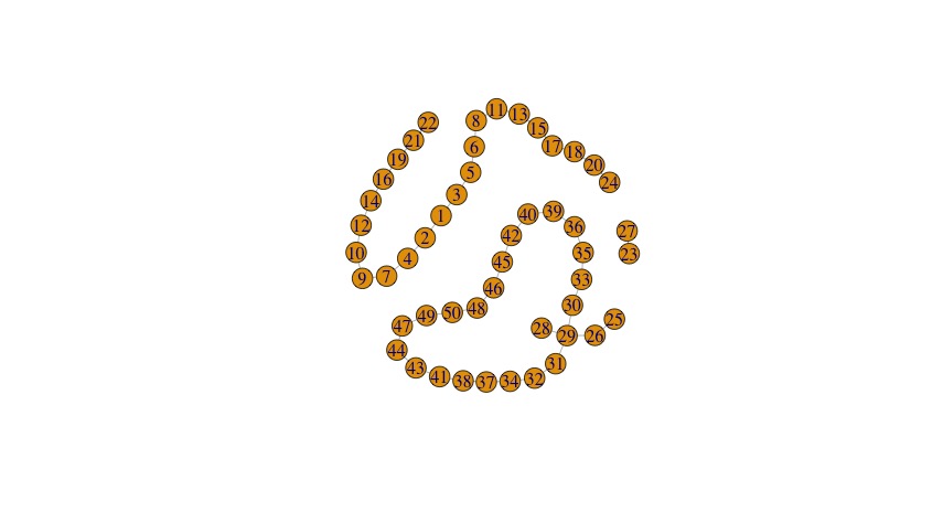
Eventually, though, you get too many intervals and you start losing relationships. At 25 intervals we’ve already reached this point with this data set:
25 intervals, still projecting to x
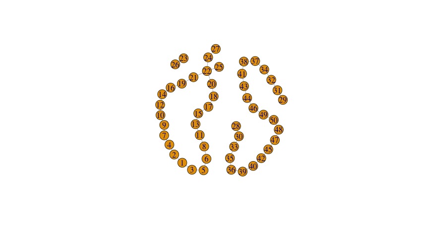
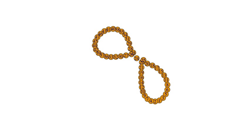
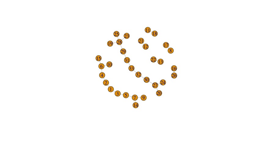
You can see that some of the features are still there but our graph is now disconnected. Why? It’s starting to pick out features of our data, not the underlying equation. Since we only have 100 data points, the resolution is actually getting so fine that it’s hitting the gaps in the data. You can see what happens if I use 200 data points instead and keep 25 intervals:
200 points, 25 intervals, project to x
Now we’re recovering the connected infinity shape, because the gaps between data points are small enough that our number of intervals doesn’t give an inappropriately small resolution.
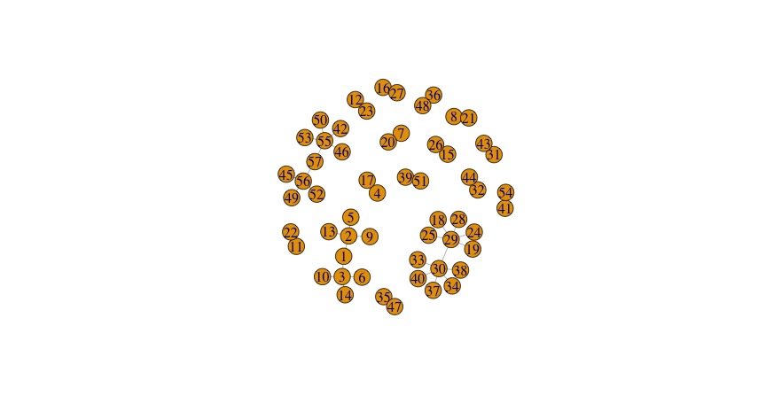
The next field is <code>percent_overlap</code>. We slice up the data using the filter function to put each data point into certain intervals. We sort of grow each interval to see how it relates to other intervals, making a point in our graph for each cluster and connecting it to neighboring points based on how much each cluster overlaps with another cluster when we play with the distance metric. If we use a very small percent_overlap, we never get a connected graph. With any data set there are some break points where we go from disconnected graph, to graph with some connections and features, to a graph that is reflecting the structure of the filter function rather than the data. Examples:
38 percent overlap, 25 intervals, 200 points, x projection
47 percent overlap, 25 intervals, 200 points, x projection
70 percent overlap, 25 intervals, 200 points, x projection
100 percent overlap, 25 intervals, 200 points, x projection
Last option: <code>num_bins_when_clustering</code>. I believe that this governs how many clusters you can get per slice (level set), but I’m still not sure about the finer points. Returning to the original example and just changing this option, we get the following:
4 bins, 10 intervals, 100 data points, x-projection
10 bins, 10 intervals, 100 data points, x-projection
18 bins, 10 intervals, 100 data points, x-projection
3 bins, 10 intervals, 100 data points, x-projection
Again with the Goldilocks — too little, too much, and just right! But the reason I’m still confused is that one would wish that the algorithm was smart enough in some sense to pick the right number of bins for you, rather than apparently spreading the data across the number of bins you enter. I’d want the number of bins to stabilize. That’s clearly not how this implementation is set up though.
Enough for today!
Sign up for the email list if you like this kind of material.
One thought on “TDAmapper in R”